
The Loaded Bookshelf
I'm an Editor in book publishing. All opinions are my own.


Jackets, Ooh-la-la: YA Edition


Just as with adult jackets, YA book jackets play a big role in encouraging me to pick up or learn about the book. The problem with YA: I really dislike the generic "girl looking sad/wistful/seductive/powerful" jackets. These are apparently quite successful, though, as publishers keep using them. Alas.
GRACELING -- I've always found the colors and image on this jacket beautiful, even though I think overall the design looks a bit "young" for the actual story.
CINDER -- This is a jacket of such perfection I don't even know what to say. It captures the premise of the book exactly, conveying not only with the title but the image that the story will bear a loose relationship to the classic fairy tale Cinderella, but showing with the machinery outline under the flesh that this will be no ordinary retelling.
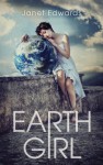
EARTH GIRL -- I know I said I hated girls on jackets, but I just really like this one, I think because the overall image of the girl resting on the world is so . . . weird. It somehow conveys a fragility in both the girl and the earth.
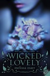
WICKED LOVELY -- this cover led me astray, because I didn't care for the book all that much (haven't found a faerie book I liked yet, so it seems faeries just aren't for me). I liked the blue-ish/purple color scheme and the mystery of the flower that looks frozen or dusted or something.
DIVERGENT -- I'm a fan of the big symbol books -- HUNGER GAMES, LEGEND, and the like, that depict something symbolic rather than people. It conveys the epic scope of the plot.
ROT & RUIN -- Isn't this one freaky? The red-rimmed, wide eye and the gray-ish flesh conveys the horror of the novel, but the bright green eye helps the image stand out.
What are your YA jacket favs?
 2
2
